


B I R A N G O N A
An evolving digital solution for the safety of local Bangladeshi travellers
UX and UI design for
iOS & Android platforms


/bee-rung-o-na/
Deliverable: High-fidelity prototype
Problem: Safety while travelling
Target: Women & 2SLGBTQIA+ people in Bangladesh
Solution: Giving the travellers access to call people and send alerts if faced with danger
Team size: Solo project with collaboration
Duration: Sep 2020- Sep 2021
Tools: Figma & Adobe Creative Suite
My Role: Founder + Product Designer
The name birangona (Bengali: বীরাঙ্গনা; "war heroine") was the title awarded by the Government of Bangladesh to women raped in the
Bangladesh Liberation war
Research Process
September 2020 - December 2020
Tools: Pens, Papers, Instagram, and Patience
You will find the chronological order of researches that were conducted and the reason for these particular methods.
Stakeholder Analysis
This step revealed a big market that needed its safety concerns addressed.
Additionally, the analysis revealed the incentives, intentions, and reasons that drive different members of the travel business.
September 2020

Empathy Mapping
With a sensitive topics like safety and assault, it was important for me to empathize with both the travellers and the businesses.
The empathy maps revealed certain pain points:
1. Doesn't know who to trust on the streets
2. Inconvenient security system
3. Acceptance of the potential danger
October 2020


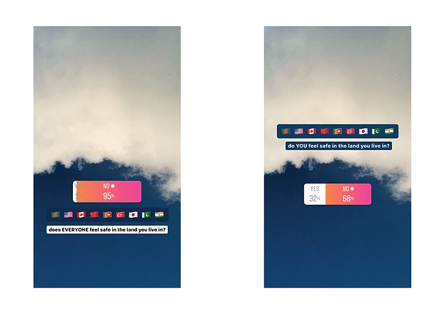
Design Ethnography
Surveys, questionnaires, and interviews are relatively tricky when it includes questions of safety, inclusivity, honesty, and racism. To nullify the tension, I decided on using methods that would maintain anonymity amongst participants and be user-friendly; all this was done through the simple use of social media.
This study showed how the public and potential users engage with the topic of safety.
November 2020
Extracting Perspectives
An example of a survey conducted on Instagram. “What makes you trust a product or person?” was given as a prompt to the Instagram audience to test their willingness to respond.
contd. November 2020

Design Process
January 01, 2021 - September 14, 2021
Tools: Figma, Adobe Photoshop, Adobe Illustrator
Members & Roles:
Irfan - Wireframing, Prototyping & Mockups, UX & UI deductions
Apanuba - Logo Designing
Crazy 8s
8 rough solutions that formed the ground of the lo-fidelity prototypes and wireframes.

Icons and Navigation
The viable designs and solutions from crazy 8s were filtered and fleshed out. Icons, buttons, and navigations were sampled and tested in low fidelity.

Mockups & UX+UI
I wanted the visuals to be bold but clean. With the initial visuals in mind, I approached Apanuba Puhama who developed branding as I worked on the UI.
We decided on the red that contrasted nicely with the white and the black. It also instilled a sense of urgency and a call to action. Additionally, the drop shadows were incorporated to help guide the users.

Iteration 1.0 | Pathways
After reiteration and user testing the wireframes, I developed a basic user flow. Individuals can use the platform to choose nearby allies during the trip. The allies will have live access to the updates of the trip and potential danger. Primary functionalities include rating pathways, safe spaces, and finding allies nearby.

Iteration 2.0 | Alert
To enhance the chances of safety, I designed a system that allows individuals to set up a trigger word. In case of emergency, if the device is not at your disposal, the trigger word can be spoken or screamed that alerts everyone selected as allies. Soon, the platform will alert everyone who is on the list. Current locations and other details will be added to the respective notifications.

Iteration 3.0 | Privacy
With safety and consent at the heart of this project, it was imperative that I ensure the privacy of the individuals is respected and reminded. Birangona’s need to access the current location and record audio is a severe gamble that is risky if it is not well executed.
The added functionality focused on reminding the individual of their location and audio settings. They are complete freedom to change settings accordingly. Furthermore, it is essential to note that only necessary information is asked from the individuals while joining the system.

The Screens of Birangona


And?
Conclusion & Take-aways
What’s wrong?
- The logo and aesthetics might be a bit too intense.
- What if the person cannot speak?
- Need to perform enough usability testing
What’s next?
- Add a feature that is more physical than audio. For example, add a system that acts as a trigger action if a certain button is pressed for a long time.
- Improve the functionalities and make the interface much cleaner and more inviting.
- Get public opinions and reiterate the responses from the testings.